![]() AuthorElisa Cressati
AuthorElisa Cressati- CategoryStory
- Last Updated11.06.2026
- Reading time8 minutes


Over the past 5 years, our platform has grown from a small set of governance tools into a suite of applications supporting multiple areas of the Microsoft 365 ecosystem. Our products worked and our customers loved them, but as our portfolio expanded, one thing became increasingly clear to us: pushing new features wasn’t going to be enough anymore.
As a SaaS company, we understand that sustainable product velocity, UI consistency and user-centered design are structural prerequisites for scalability. Fast iteration cycles, predictable delivery, and a coherent user experience directly influence customer satisfaction, operational efficiency, and long-term maintainability.
This challenge goes far beyond a simple redesign. It’s a foundational shift in how our platforms feel, behave, and scale.
Excited? We certainly are.
The need for an internal design system
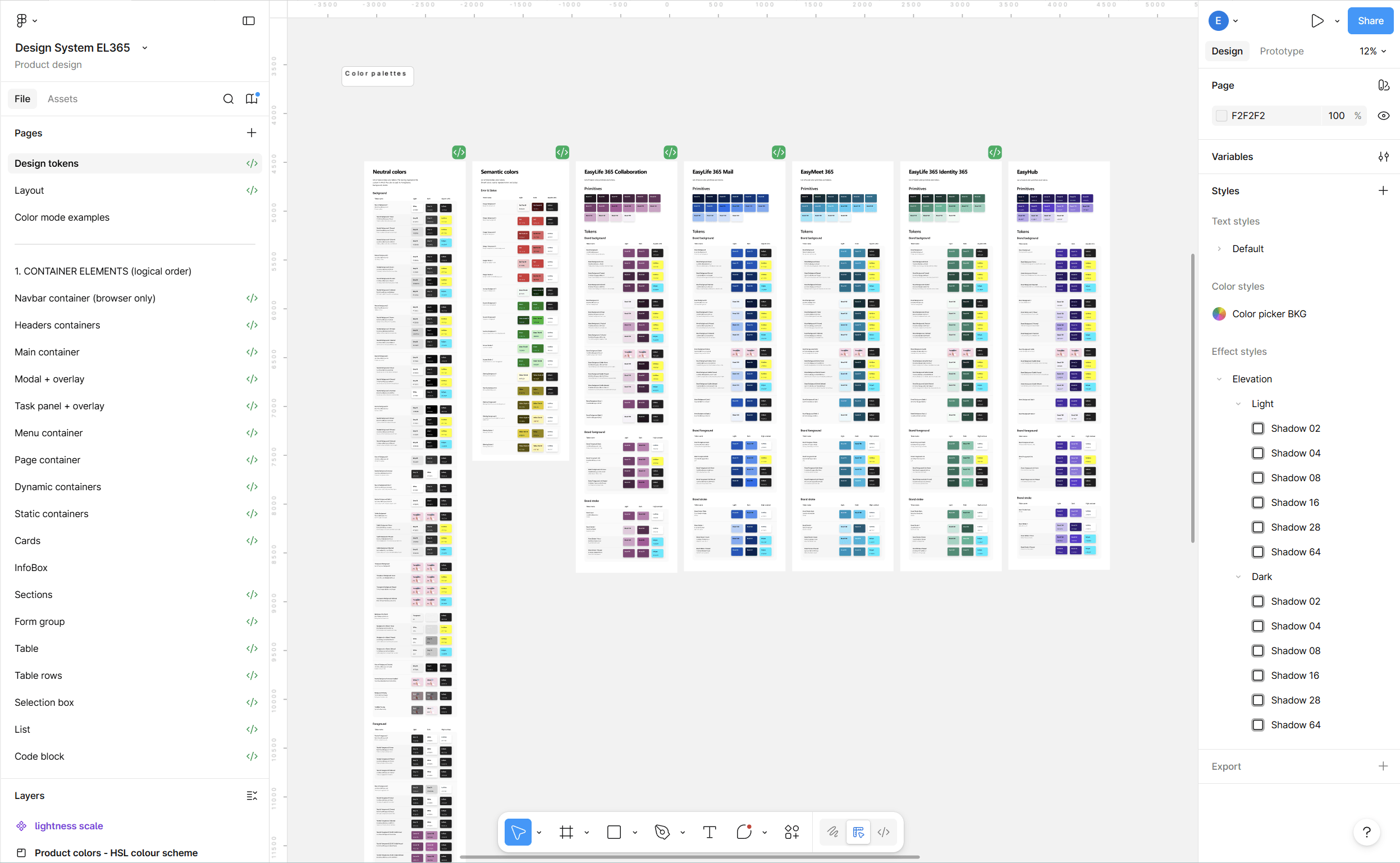
A design system is a shared set of rules, components, and guidelines that define how a product looks and behaves. It includes reusable elements like buttons, forms, colors, typography and layouts that designers and developers use as building blocks to create apps and websites consistently.
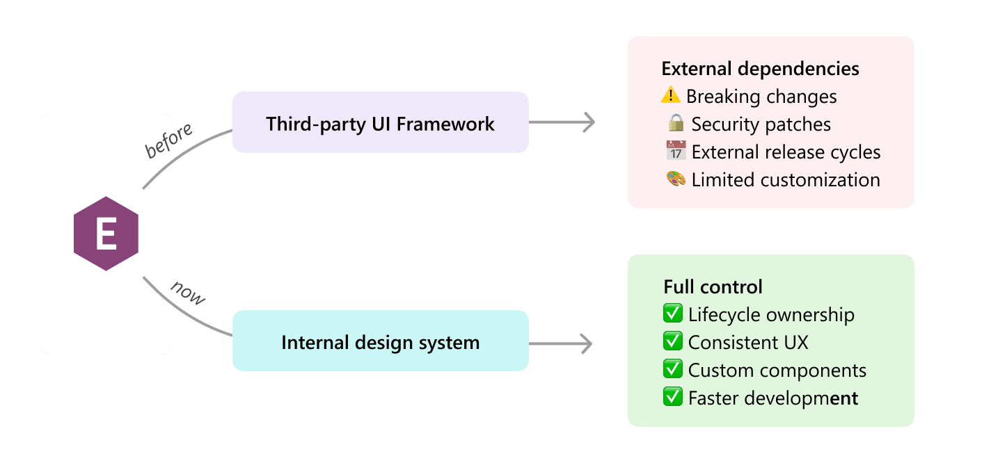
When you build something like an app or a website, you can take two different approaches: you use outsourced building blocks or you carve your own building blocks.
In the early stages of the company, using a third-party UI framework, ready-to-use design systems built for developers was a logical decision. We relied on such frameworks to accelerate development, reduce upfront investment, and keep our focus where it mattered most: delivering product value fast.
However, there’s a catch. When a product relies on third-party UI frameworks, it also inherits part of their lifecycle. That means critical responsibilities, like maintenance, security patching, compatibility updates, and architectural evolution, are implicitly outsourced to external projects. This meant that our products’ stability, delivery timelines, and visual consistency depended on external providers.
As our products scaled, this dependency became a strategic risk.
On top of that, we wanted our products’ look and feel to reflect our company’s identity: clear, simple, and with a strong personality.
Ultimately, all these problems have contributed to a common solution: an internal design system.
The impact on product velocity
When I talk about product velocity, I mean the ability of a product team to consistently deliver valuable improvements quickly, predictably, and sustainably.
It’s not just about “moving fast.” It’s about moving fast without breaking things, accumulating chaos, or slowing down later.
An internal design system reduces repeated work, lowers cognitive load for implementation, and helps preserve velocity as the product suite grows. By providing reusable components, clear interaction patterns, and standardized design tokens, developers no longer need to interpret one-off designs or reinvent UI solutions for each feature. Instead, they assemble consistent, pre-defined building blocks with confidence.
This reduces duplicated effort, shortens development cycles, simplifies testing, and makes new features easier to ship, all while maintaining visual and functional consistency across the product.
The Impact on User Experience
A well-built design system is the backbone of a good user experience. However, on its own, it doesn’t really address product usability.
To do so, we rely on user-centered design, a design principle that puts the focus on real users’ needs and pain-points. Customer feedback, internal and external testing, and continuous iterations are the core of our product development strategy.
Here I collected a few examples of how the new design system and our user-centered design approach have helped us deliver clearer, simpler and faster interfaces.
A Microsoft-native look and feel with our own twist: clear, simple, and with a distinct personality
Our products operate within the Microsoft ecosystem and are often accessed directly from applications like Teams or Outlook. The experience therefore needs to feel familiar while maintaining a clear product identity. To achieve this balance, we drew inspiration from Microsoft’s Fluent design system and its established interaction patterns. This allowed us to align with users’ existing mental models and reduce the learning curve. At the same time, we introduced our own visual language and adapted or built from scratch several components to better support the specific workflows of governance applications.
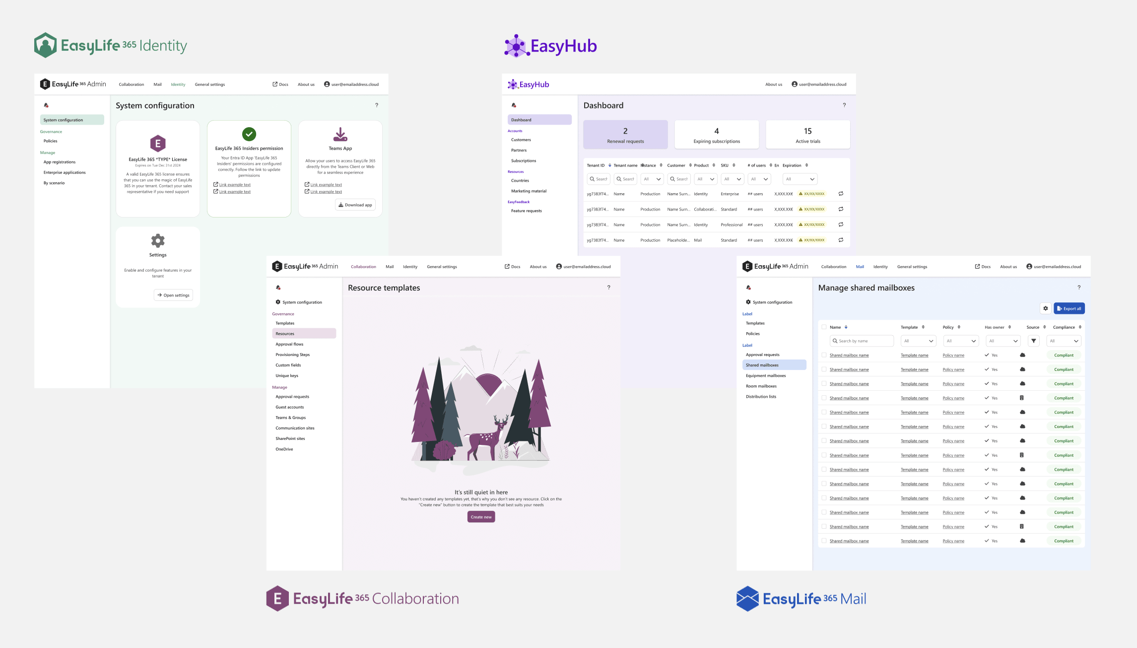
Multiple products, one ecosystem
What started as a small set of governance tools has grown into a suite of applications supporting different domains and user roles. While each product serves distinct workflows, they are connected through a shared design system and consistent interaction patterns.
This creates a coherent product ecosystem: interfaces feel familiar across applications, and users can transfer knowledge from one product to another. By recognizing the same patterns and behaviors, they can navigate new environments and complete tasks without having to relearn how the interface works.
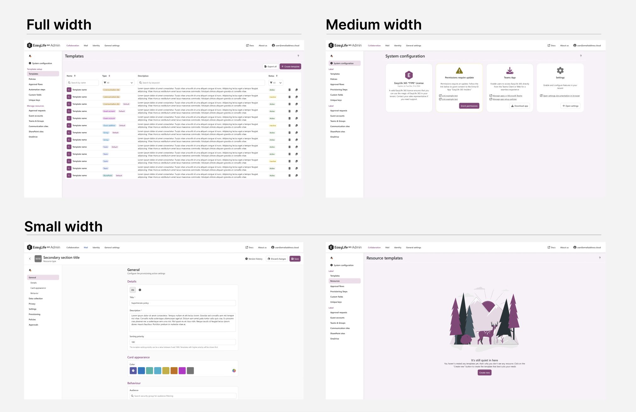
Optimized layouts for large screens
Because many of our users are IT administrators who work on large displays, we optimized the interface to take advantage of available screen space. Rather than applying a single layout across all views, we designed adaptive layouts based on content type and user tasks.
Data-heavy views such as tables use the full width of the screen to maximize information density and support efficient scanning. Card-based views use a medium-width grid to maintain visual structure, while forms and text-heavy interfaces are constrained to a narrower width to improve readability and reduce cognitive load.
By adapting layout patterns to both user roles and content types, the interface remains efficient for power users while preserving clarity and usability.
Sleek but powerful navigation
Navigation should help users stay oriented. In the previous experience, navigation was fragmented, making it difficult to understand where you were within the product or how to move to another section. We introduced a persistent left-side menu that remains visible at all times, providing a clear structure and quick access to the main areas of the application. For more complex pages, the menu also supports in-page navigation: selecting an item automatically scrolls to the relevant section. This creates a smoother experience, helping users maintain context and move through the product with confidence and ease.
A more fluent experience: "Don‘t make me think"
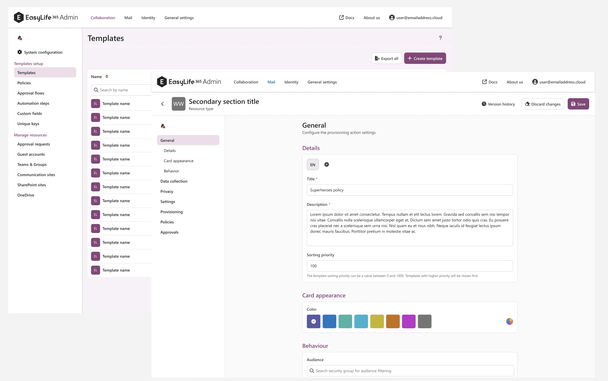
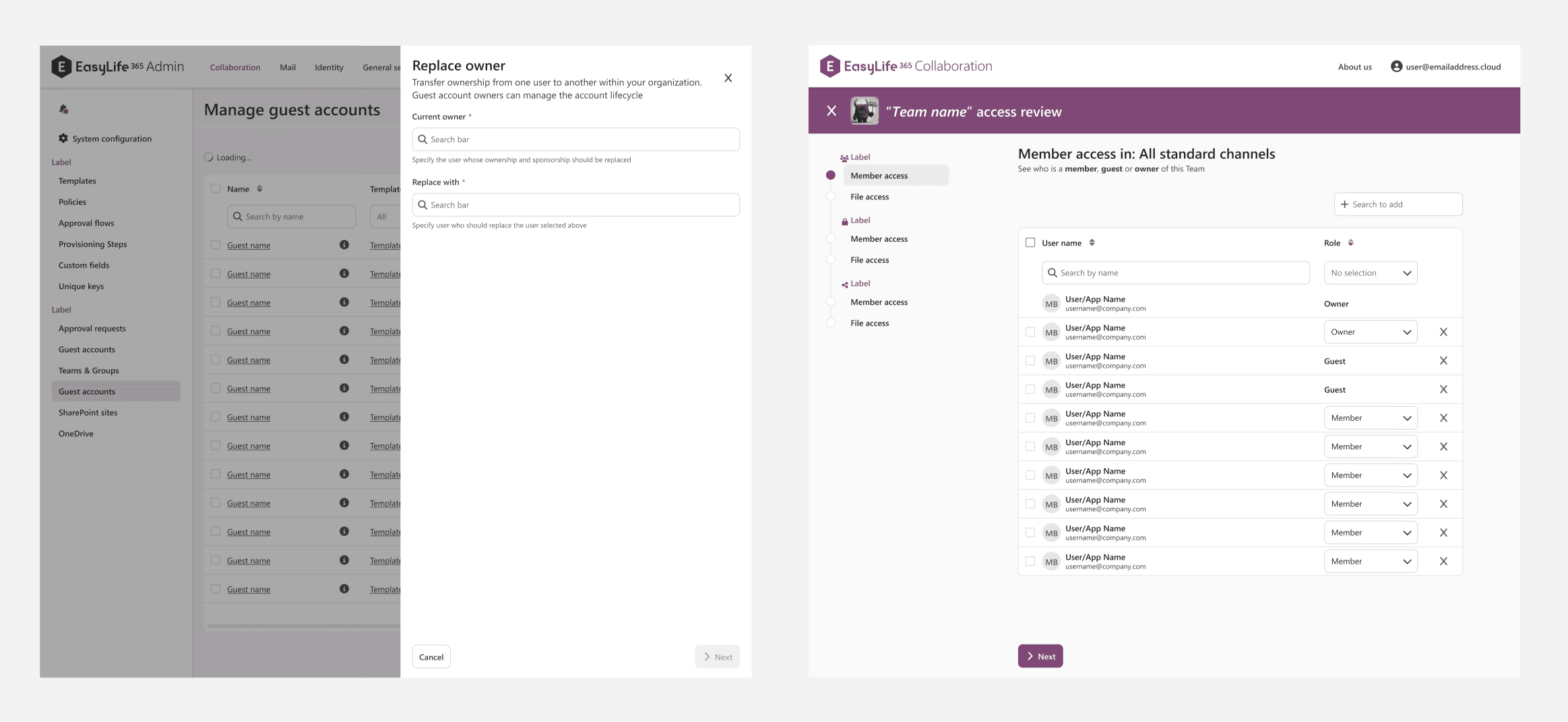
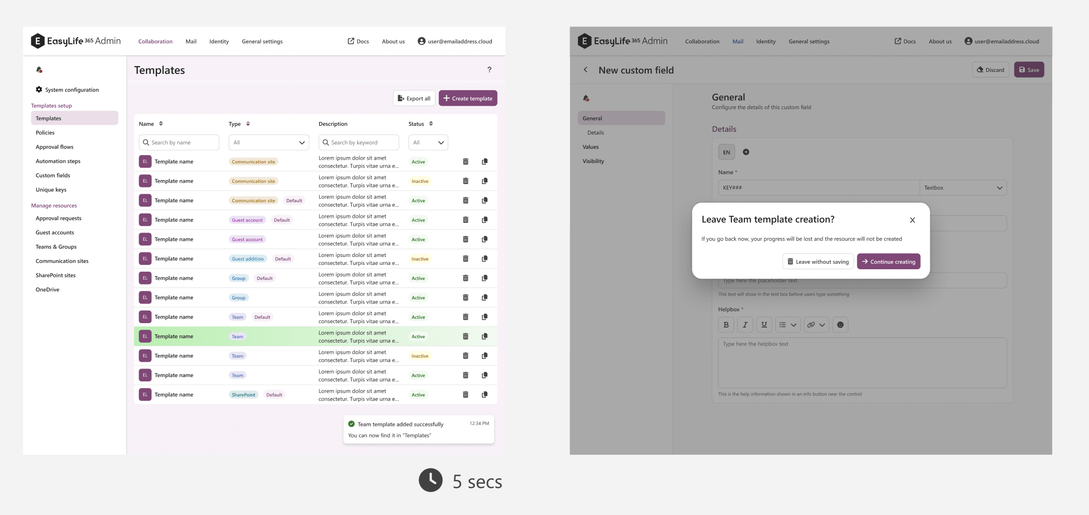
A key goal of the redesign was to make common tasks faster, clearer, and more intuitive to perform. Following the principle of “Don’t make me think,” we simplified interactions so users can focus on completing their task rather than figuring out how the interface works. Clear primary calls to action guide users through each step and remain visible even when disabled, so it’s always obvious what action comes next and what information is still required. We also introduced task panels that open as overlays on top of the main screen, allowing users to complete actions without losing their place in the broader context. For more complex processes, step-by-step wizards provide clear progress indicators and navigation menus that show what stage users are in, what comes next, and how many steps remain. The result is a smoother, more predictable flow that keeps users oriented and focused on the task at hand.
Clear processes with contextual information and visual feedback
Managing governance tasks often involves actions that have real consequences, so the interface should make system responses clear and reassuring. To improve clarity, we introduced richer visual feedback throughout the product. Success toasts confirm completed actions, while subtle animations such as highlighting a table row in green when an item is added or red when it is removed make changes immediately visible. We also added safeguards like confirmation dialogs when users attempt to leave a detail mask with unsaved changes. Alongside these interaction improvements, we revisited the product copy: titles, subtitles, button labels, and previously icon-only actions were rewritten to provide clearer context. Together, these changes strengthen system feedback, reduce uncertainty, and give users greater confidence when performing important actions.
A Foundation for the Next Stage
This launch is not just a visual refresh. It is the result of deep product evolution: from fragmented applications to a coherent suite, from dependency to ownership, and from short-term speed to long-term scalability.
The rebrand is the part users will see, but the real impact is what it unlocks: a platform that can grow without losing consistency, stability, or trust.
And as we continue to expand our governance capabilities across the Microsoft ecosystem, this foundation ensures we can keep building fast and elevating our user experience.
We can’t wait to see what comes next!


